What I’m listening to

I took a class in college called The Art of Audio Narrative and I tried to do a piece that told a story through only ambient environmental noises as someone went through their day. It wasn’t really successful. That class ruled, though, it was one my favorite classes I took.
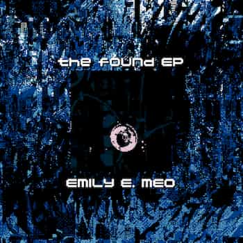
Anyway this album reminded me of that because the basis for this EP is recordings of mostly non-musical stuff found around the house, but unlike what I tried to put together it’s actually really good.
I’m pretty sure I found this album through IZUNA DROP. I was picking up some of their albums and I think it was in the “you might also like” section.
What I’m cooking
I used barley instead of farro and threw the parmesan rind in the while it simmered. Easy prep, and pretty delicious.
Fonts and legibility
I’m trying out a new font on this site that is designed for legibility, Atkinson Hyperlegible.
Web fonts add a significant amount to page weight: in this case about 70kb for all variants (regular, italic, bold, bold+italic). For comparison I’ve been aiming to keep images around 20kb.
I’m gonna keep thinking about it, but for now I think it’s worth a shot. I’d love to read more research on legibilty—this literature review paper seems like probably a good start but I don’t want to pay $37.50 to read it! I’ll have to keep looking to see if I can find some good quality open access papers.
I’m nostalgiac for some early web stuff, but I’m glad we’ve moved on from the era when the pinnacle of style was to have the smallest, most illegible typography possible, like a light grey 8pt font font against a medium grey background.
Browsers (and CSS) have improved a lot so zoom levels work a lot better than they used to, which is also great. It’s unfortunate there doesn’t seem to be a good equivalent of Cmd-+ on mobile—there are a lot of sites I visit on my phone where I wish the dang text was bigger, and my eyes really aren’t that bad!
Related to legibility: Comic Sans is good actually.
I unironically use & love Comic Code Ligatures as my coding/terminal font. I spend all day staring at terminals and editors and I find it easier on the eyes at smaller sizes than other monospace fonts I’ve tried! Totally worth the money in my opinion.
Local dev file serving
I was using python -m SimpleHTTPServer for local file serving while I’m developing but it doesn’t seem to do well with either staying open for long periods of time, or recovering from periods of sleep—or something, I’m not sure what causes the issue, really. What happens is that it will start taking several seconds to serve files or just reset the connection.
I switched to caddy and unsurprisingly (since it’s actually built for production use cases) it’s working a lot better.
Why did I choose caddy? Because I could brew install caddy and it had a no-config, one-line “serve this directory” command, caddy file-server.
Unison programming language
I need someone who is smarter than me to write some words about Unison because it’s kinda blowing my mind.
In particular I want to know what is the edge of “the big technical idea” of content addressed code? Where does this start to breakdown and be a hinderance? What are the tradeoffs, what is harder in this model?
I haven’t thought about it too deeply or tinkered with it yet because I’m already up to my neck in new stuff I’m trying to learn. I’m writing about it here though so hopefully I remember I come back to it because it seems really interesting!